
Signature examples
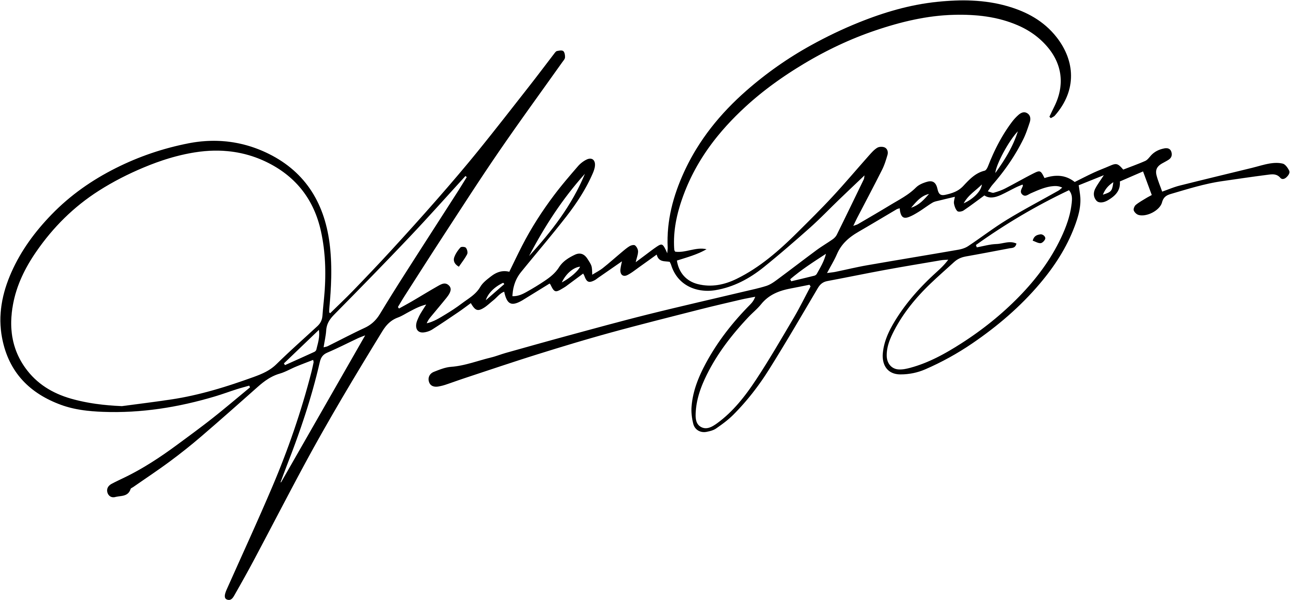
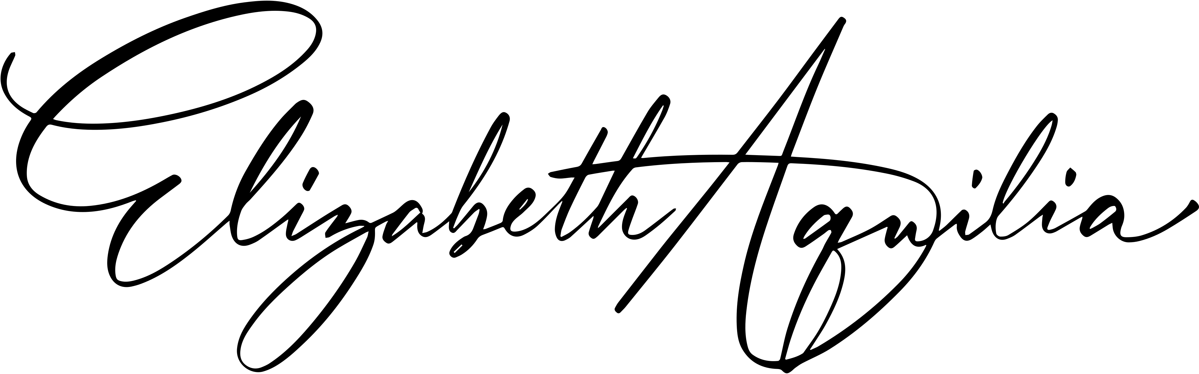
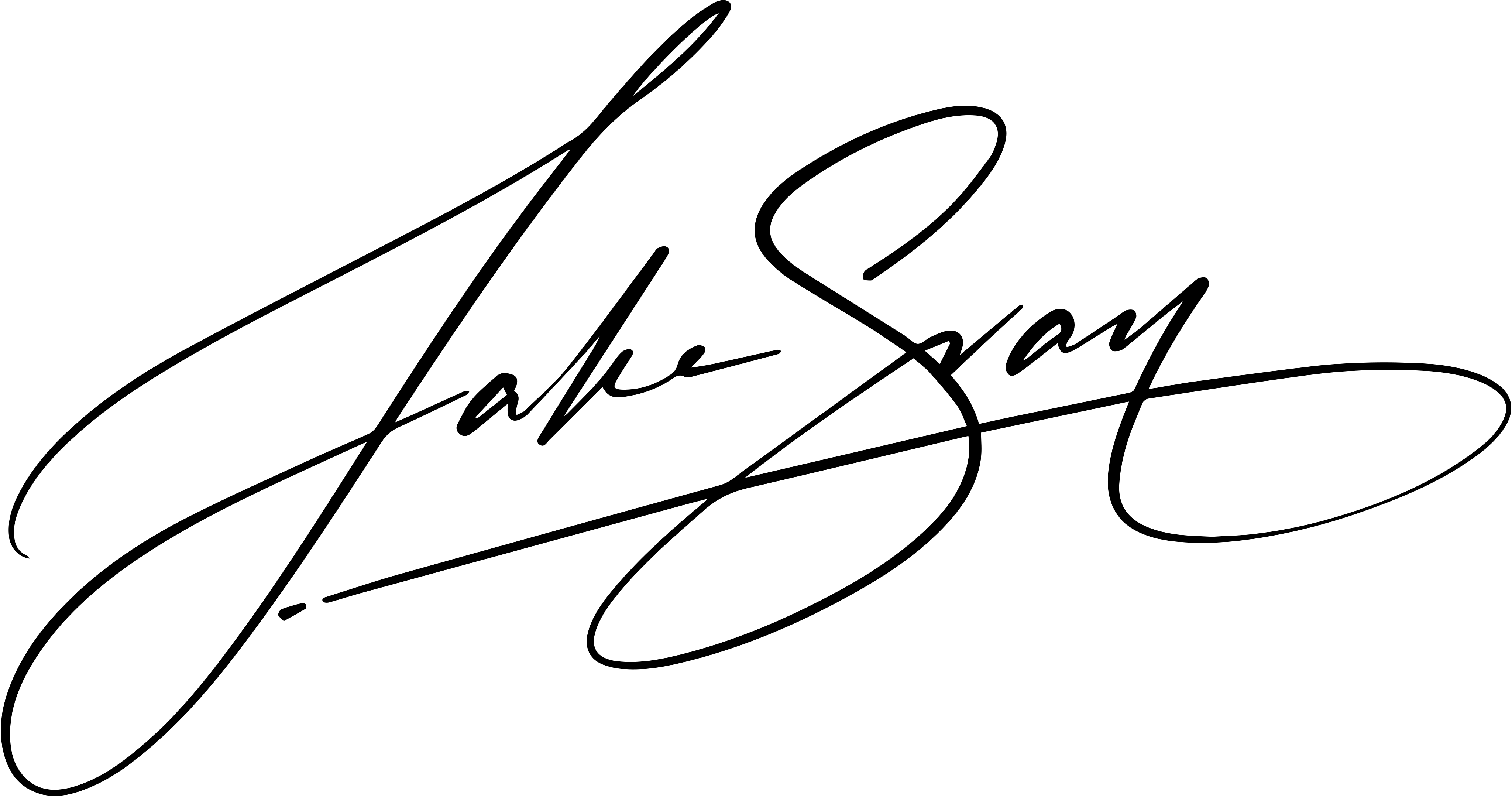
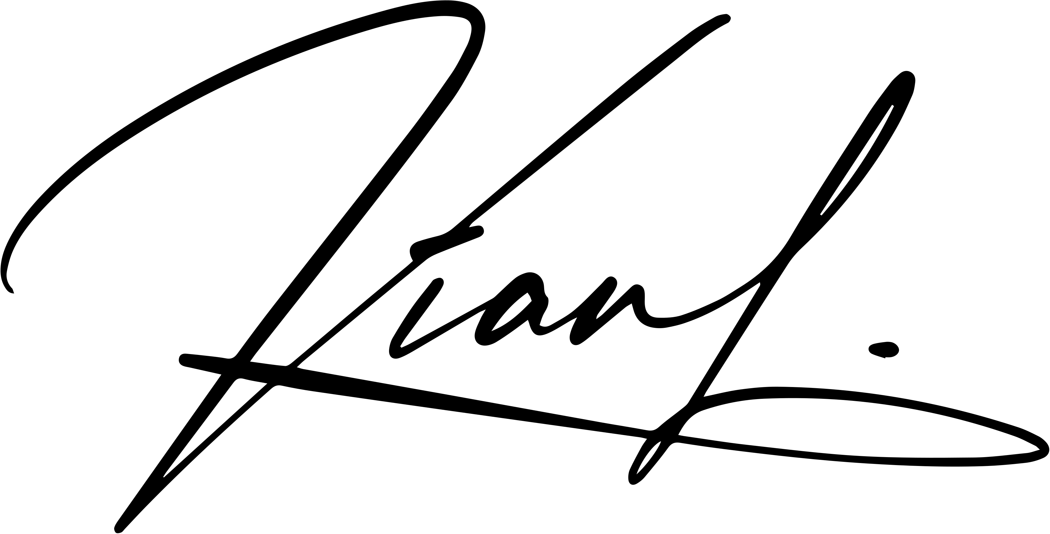
Handwritten signature examples, built for real names
A useful signature example should show more than a decorative wordmark. It should reveal how a name can be compressed into a movement that still feels distinctive when written at normal speed.
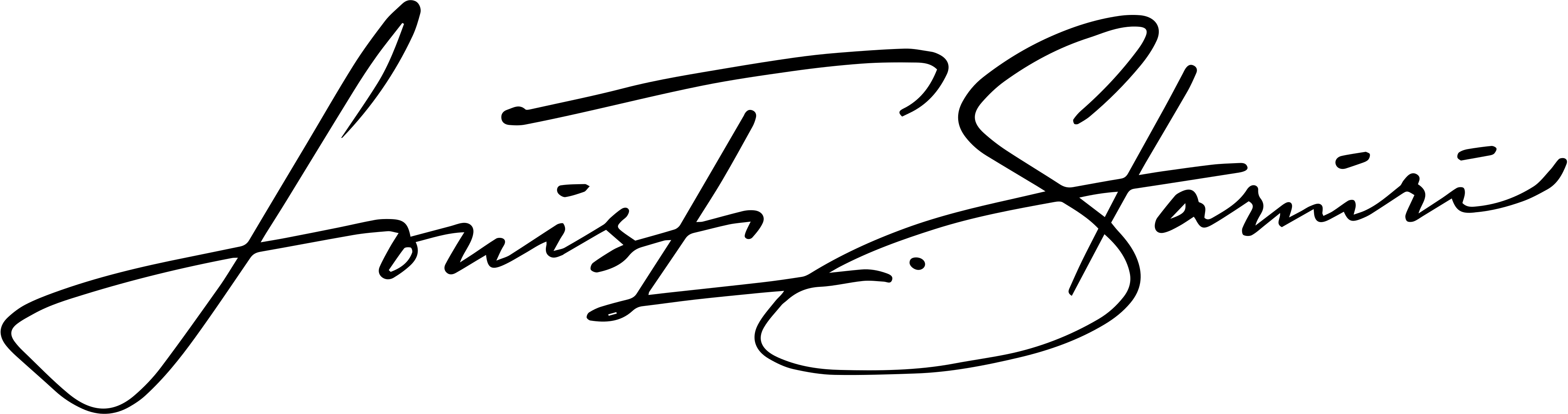
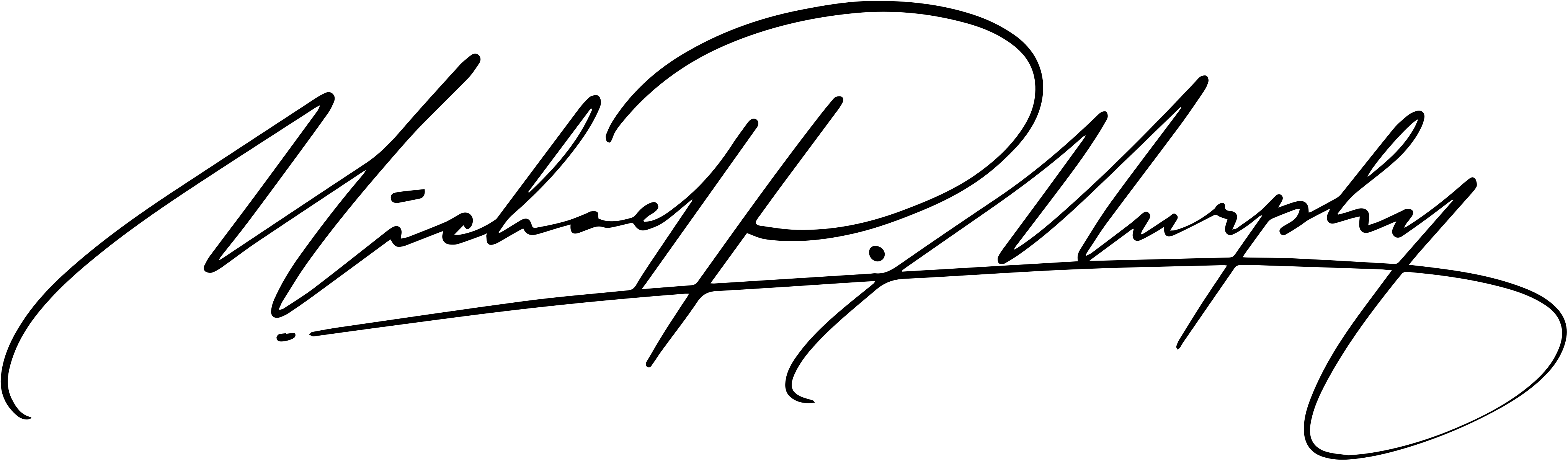
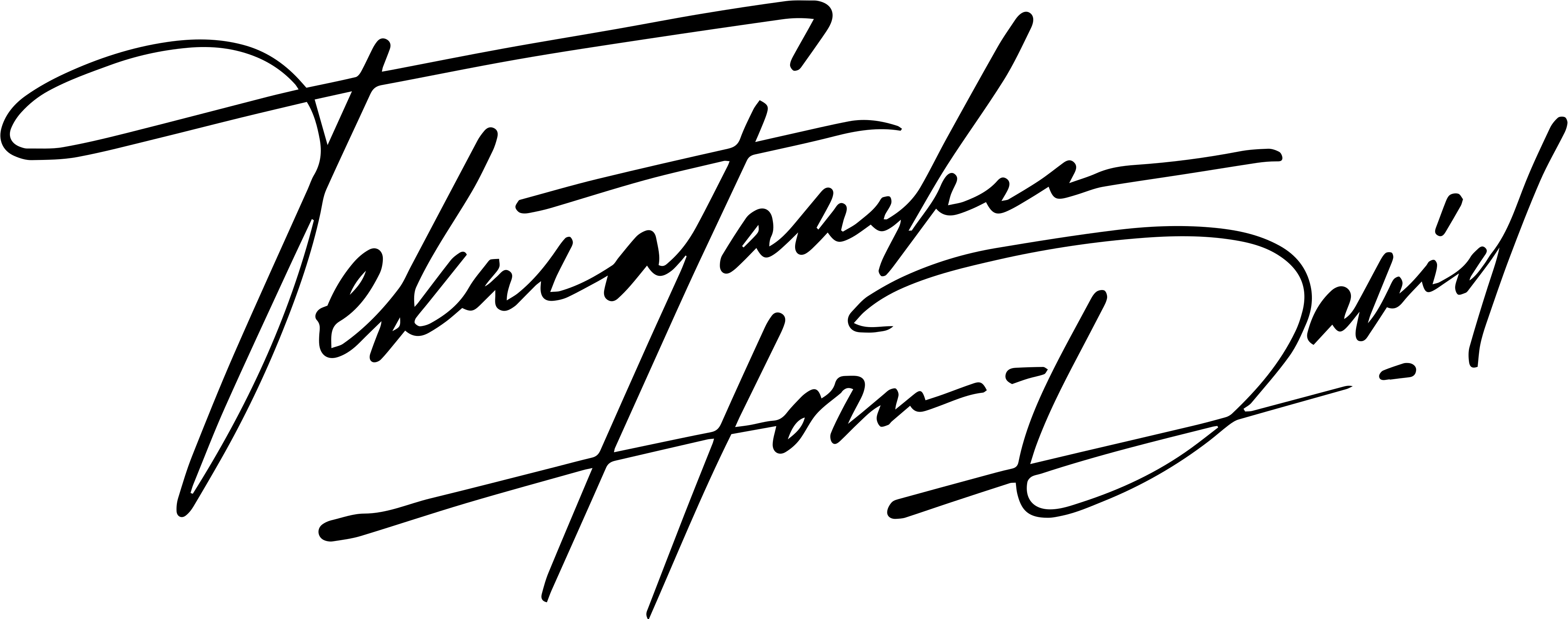
Twelve different names, twelve different structures
These examples are drawn from the signature work already displayed by CalliSign. Use them to compare structure and rhythm rather than to copy another person’s mark.




The short version
- Start with the structure of your own name, not the first style that looks impressive.
- Judge a signature by movement, pen lifts and repeatability as well as appearance.
- Use examples as direction. Copying another person’s signature defeats the point of making the mark yours.
How to read a signature example
Look first for the anchor: the letter, loop or stroke that your eye remembers. A strong anchor gives the rest of the signature permission to be simpler. Without one, extra flourishes often create complexity without identity.
Then trace the movement in your head. Count where the pen must stop, lift or reverse direction. A beautiful image can still be a poor everyday signature if the movement is too fragile to reproduce.
- Anchor letters: usually the first initial, a distinctive capital or a strong final stroke.
- Compression: how much of the name remains readable and how much becomes rhythm.
- Baseline: level, rising or deliberately irregular.
- Finish: compact stop, underline, return stroke or open flourish.
Full name, first name or initials?
A full-name signature gives a designer more raw material and can feel formal, but it is not automatically better. Initials are often the more practical choice when you sign repeatedly, have a long name or prefer a compact mark.
A middle position is also possible: keep one recognizable name or initial and compress the rest. The right choice depends on the documents and situations in which you actually sign.
Choose a direction before choosing details
Describe the impression you want in ordinary language: restrained, energetic, precise, expressive or compact. That is more useful than asking for a flourish in isolation. The line quality, spacing and rhythm should all support the same direction.
- Restrained: fewer movements, controlled proportions and a clear anchor.
- Energetic: faster diagonals, wider rhythm and a decisive finish.
- Compact: initials or compressed name forms with minimal travel.
- Expressive: larger contrast between the anchor and supporting strokes.
Need a design for your own name?
Use the examples to identify a direction, then brief a calligrapher to turn that direction into a signature you can practice and repeat.
See signature plans